정리
[비전공자를 위한 HTML/CSS] (40) 미디어 쿼리 실습
쿠르쿠르쿠
2021. 8. 20. 18:55
디스플레이 크기에 따른 body 요소의 background-color 크기 변경 (width)
세부조건
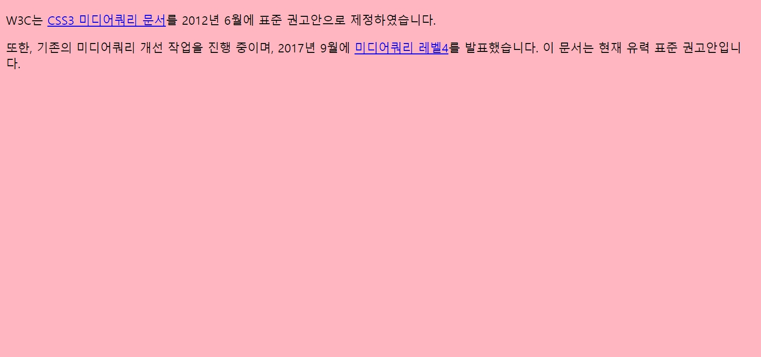
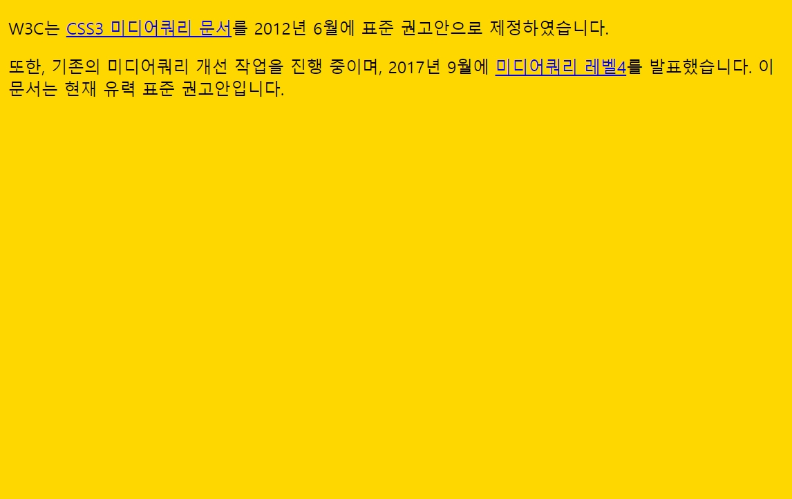
- 0~767px 이면 : gold (mobile)
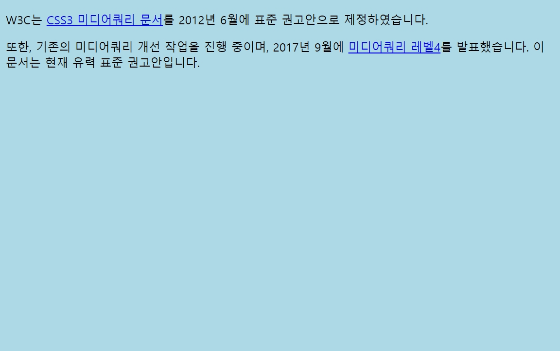
- 768px~1024px 이면 : lightblue (tablet)
- 1025px~ 이면 : lightpink (desktop)
<!DOCTYPE html>
<html lang="ko">
<head>
<meta charset="UTF-8">
<title>MediaQueries</title>
<style>
/*
0~767px 이면 : gold
768px~1024px 이면 : lightblue
1025px~ 이면 : lightpink
*/
@media screen and (max-width: 767px) {
body { background-color: gold; }
}
@media screen and (min-width: 768px) and (max-width: 1024px) {
body { background-color: lightblue; }
}
@media screen and (min-width: 1025px) {
body { background-color: lightpink; }
</style>
</head>
<body>
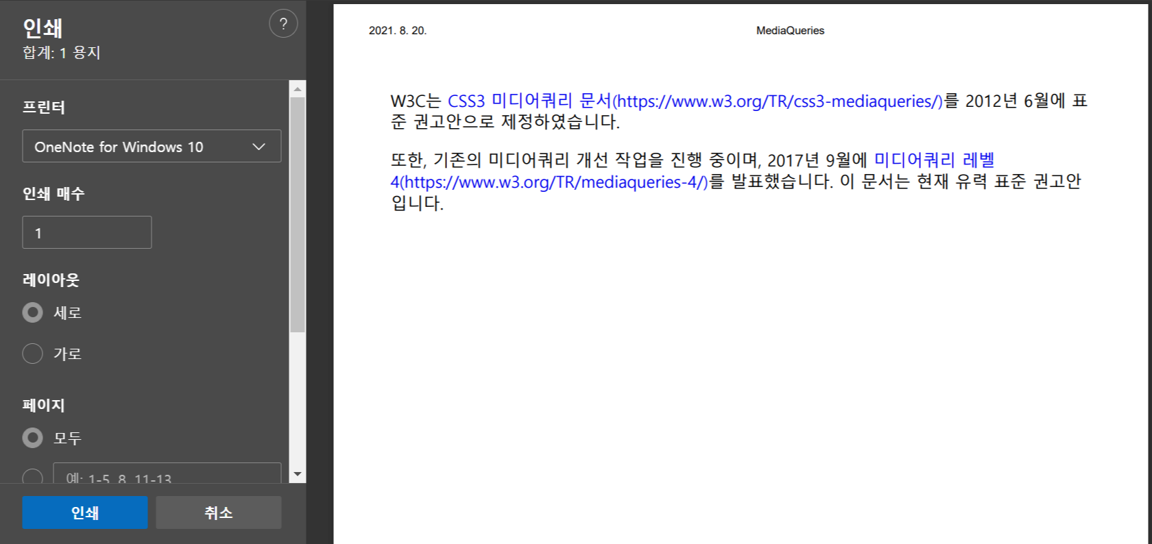
<p>W3C는 <a href="https://www.w3.org/TR/css3-mediaqueries/">CSS3 미디어쿼리 문서</a>를 2012년 6월에 표준 권고안으로 제정하였습니다.</p>
<p>또한, 기존의 미디어쿼리 개선 작업을 진행 중이며, 2017년 9월에 <a href="https://www.w3.org/TR/mediaqueries-4/">미디어쿼리 레벨4</a>를 발표했습니다. 이 문서는 현재 유력 표준 권고안입니다.</p>
</body>
</body>
</html>/* mobile first*/
body {background-color: gold;}
@media screen and (min-width:768px) and (max-width:1024px) {
body {background-color: lightblue;}
}
@media screen and (min-width:1025px) {
body {background-color: lightpink;}
}
/* desktop first*/
body {background-color: lightpink;}
@media screen and (min-width:768px) and (max-width:1024px) {
body {background-color: lightblue;}
}
@media screen and (max-width:767px) {
body {background-color: gold;}
}
웹 페이지를 인쇄하는 경우의 스타일 추가 (print)
세부조건
- 앵커 요소의 url 출력
- 앵커 요소의 밑줄 제거
앵커 요소의 url 출력
@media print {
	a:after {display: inline; content: '(' attr(href) ')'}
}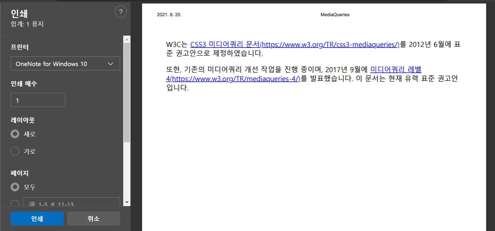
앵커 요소의 밑줄 제거
@media print {
    a {text-decoration: none;}
    a:after {
    	display: inline;
        content: '(' attr(href) ')';
    }
}
Media Queries
mediaqueri.es